
|
Published on:
September 30, 2026
|
Published on:
September 30, 2026
Quick Restaurant Kiosk UX Checklist
Use this restaurant kiosk UX checklist to improve kiosk UI, speed decisions, and create a clearer self-service experience.
A recent LinkedIn post about a McDonald’s kiosk captured a small but revealing UX problem: a guest trying to order chicken reached the dip-selection screen and couldn’t tell what to choose next, whether one or two dips were required, or how to move forward. The order hadn’t failed, but the experience had stalled.
That kind of roadblock matters. Kiosks are meant to make ordering faster, yet every unclear prompt, overloaded screen, or ambiguous next step adds hesitation. And kiosk adoption alone does not guarantee a good experience: Tillster research found that while 64% of diners use kiosks regularly, 30% have abandoned a kiosk and ordered at the counter instead. Good UX helps close that gap.
The real benchmark, then, is not just transaction speed, but decision speed: how quickly a guest can understand each screen, make a choice, and keep moving.
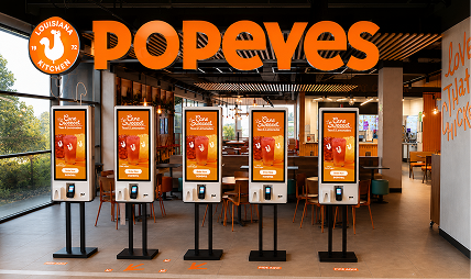
Use this checklist to evaluate whether your kiosk UI keeps guests moving instead of making them stop and think.
#1 Design for a kiosk, not a mobile screen
Kiosks are used standing up, on a large display, often with other guests waiting nearby, so the experience should be designed for quick, comfortable interaction.
- Use large, easy-to-tap touch targets
- Keep type readable from a standing position
- Create a strong visual hierarchy
- Favor focused screens over dense layouts or excessive scrolling
#2 Make the next action obvious
Every screen should make it immediately clear what the guest is expected to do next.
- Use straightforward, action-oriented labels
- Keep primary buttons in consistent locations
- Guide guests through logical, step-by-step flows
- Avoid ambiguous prompts or competing calls to action
#3 Build a menu guests can scan quickly
Guests should be able to find what they want quickly while still having the freedom to browse and discover.
- Organize items into clear, intuitive categories
- Use strong product photography
- Keep pricing easy to find
- Use recognizable visual cues to support faster scanning
#4 Make customization feel manageable
Guests should be able to find what they want quickly while still having the freedom to browse and discover.
- Organize items into clear, intuitive categories
- Use strong product photography
- Keep pricing easy to find
- Use recognizable visual cues to support faster scanning
#5 Keep the cart visible and easy to edit
Modifiers, combos, and build-your-own items can create friction if too many decisions are presented at once.
- Break complex choices into logical steps
- Clearly separate required and optional selections
- Show guests where they are in the customization process
- Keep each screen focused on a manageable set of decisions
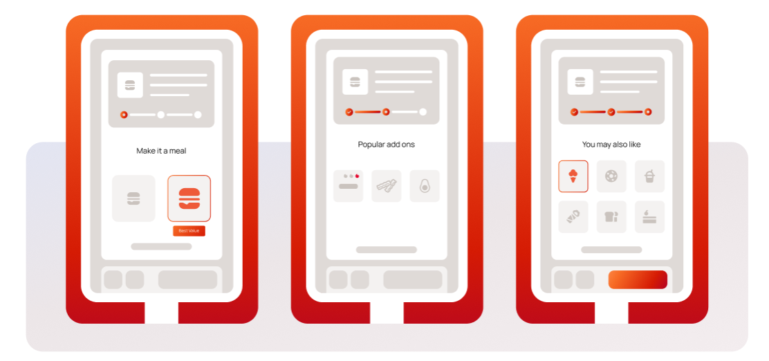
#6 Use recommendations without interrupting the journey
With 43% of kiosk orders containing just one item, there is a clear opportunity to help guests discover complementary choices without slowing them down.
- Surface sides, drinks, upgrades, or add-ons at logical moments
- Keep recommendations relevant to what the guest is already ordering
- Avoid prompts that interrupt or derail checkout
- Use recommendations to support the decision, not create another roadblock
#7 Design for more guests from the start
Accessibility and localization should be built into the interface rather than added later.
- Keep controls within accessible reach
- Use clear contrast and readable typography
- Support accessible navigation
- Make language selection easy to find and use
- Structure ordering flows so they remain clear across languages and guest needs
Want to go deeper on what makes a kiosk experience work?