
|
Published on:
August 14, 2026
Designing a User-Friendly Kiosk Interface: A Quick Guide for Quick-Service Restaurant Leaders
Design a user-friendly restaurant kiosk interface with UX best practices that reduce friction, increase order completion, and boost guest satisfaction.
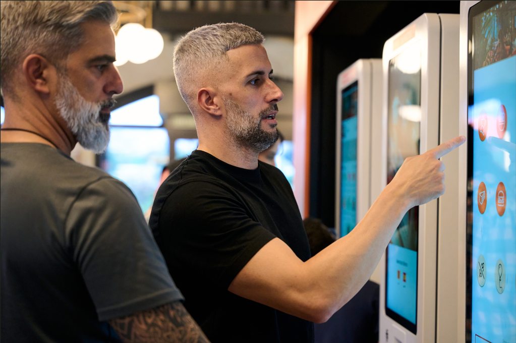
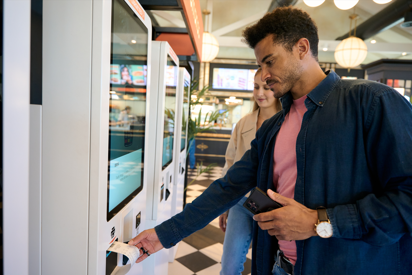
Self-service kiosks have become a familiar sight in quick-service restaurants. They’re a customer favorite, thanks to their efficiency and ability to mitigate the pain of a long line during the lunch rush.
However, it’s a mistake to assume that all kiosks simply arrive with an ideal customer experience out of the box. On the contrary; it’s a well-documented occurrence that customers will get frustrated with a kiosk and abandon their order if they can’t understand the navigation, menu, interface, or payment system.
According to Tillster's 2026 Phygital Index Report, 64% of diners now order at an in-store kiosk at least several times a month, up from 61% in 2025. Yet even with that demand, roughly 30% of kiosk users abandon the screen and get redirected to the counter, usually because something in the interface stopped them.
You can avoid this and provide your customers with a good kiosk experience by applying the laws of UX (User Experience) to kiosk interface design.
Why pay attention to kiosk interface usability?
A well-designed kiosk reflects well on your brand. It can reinforce your restaurant’s ambiance and personality. More importantly, it can remove the frustrating ‘pain points’ customers experience with bad kiosk interface design. And this translates into shorter wait times, reduced workload on staff, and improved customer satisfaction and engagement – which results in improved profitability.
As mentioned above, an interface that customers don’t understand will lose orders. It can also add to employee frustration, as they’ll be called over to continually help customers complete their kiosk order. And even if customers can understand how to place and pay for their orders, poor design can make it hard to customize orders and capitalize on upsell opportunities.
On the other hand, paying attention to your kiosk’s user experience (including the kiosk location) can make the transaction smoother and more enjoyable to customers. This results in repeat users and higher ticket values. For a deeper look at how design choices translate into average check, throughput, and labor, see our playbook, High-Performing Kiosk Design.
How to design a user-friendly kiosk interface
Most QSRs serve a wide variety of customers. This can make kiosk design challenging, as you need to take into account a correspondingly wide variety of abilities, backgrounds, and comfort levels with tech. Thus, using an out-of-the-box interface rarely works. You’ll have to customize it – or at least work with your vendor to adjust it – to your needs. As you do so, keep your customers firmly in mind.
Analyze your restaurant audience
This is where we get into the laws of UX. User Experience encourages builders, developers, and designers to create products and experiences centered around people. Specifically, everything is centered around the people who will use that experience (the users) and how they will use it. So, your very first step is to analyze:
Who will use this kiosk?
When and why will they use it?
What problems might they have with using it?
How can we adjust the interface design to minimize or eliminate these problems?
Use your customer data to help find the answers to these questions. Once you understand what your customers want from the kiosk, you can start coming up with ideas for the design and layout of the interface.
One thing the data makes clear: there's no single "average" kiosk user. Research shows traffic splits into roughly two even halves. Some guests are Beeliners who want speed and minimum friction; others are Explorers who want to browse and discover. Design for only one and you lose the other, so the goal is an interface that serves both in the same flow.
Keep your ordering process simple
When it comes to the ordering process, simple is better than complicated. As a rule, the average transaction (think dinner for one, not lunch for the whole family) should be completed within 1-2 minutes. To ensure a streamlined process, keep your menus visually appealing but simple. Try to avoid anything that will distract from the ordering process or confuse the customer.
It helps to think of the order in three stages, each with a job to do. The homepage sets the trajectory: lead with clarity and surface trending or popular items. Customization is where check grows: put the most likely add-ons where guests expect them, and use progress bars so no one bails mid-build. Cart and checkout should keep the order summary visible and easy to edit, and surface last-minute upgrades without adding friction.
Next, consider screen size. You can fit more information on a larger screen, but you need to be aware of the limitations of various screen sizes. If you’re supplying more than one kind of self-ordering system (i.e., a freestanding kiosk plus countertop or tabletop ordering systems), use a responsive layout that will automatically adjust to different screen sizes.
It’s also good to reference some of the core principles of user experience design:
- Put elements in logical order. For example, if a customer selects a sandwich, the kiosk should offer ways to customize it after the customer has selected their sandwich. Only after the customization is complete would the system move on to offering fries and a drink.
- Keep things familiar. Have symbols mean the same thing throughout the process. For example, an icon of a person talking might be used as an “I need help” button throughout the ordering process. Once the person confirms their order, don’t change this icon to mean something like “I’d like to offer feedback about my experience”.
- Use shapes to indicate functions. You’ll often see “Next” buttons shaped like a forward-facing arrow and “Back” buttons like a backwards-facing arrow. This is an excellent example of letting the shape of an element indicate its purpose. Even if customers don’t read the text labels, they’ll instantly understand what that button does.
- Consider mental models. Mental models are simply the way most users expect things to work. For example, when we see an “X” button, we automatically assume it means “Cancel”. A checkmark means “OK” or “Keep going, this is good”. By understanding what users expect an item to do and then using it accordingly, we reduce their cognitive load – i.e. the amount of brainpower needed to accomplish a task. The result is that the experience feels smoother, easier, and more intuitive.
- Graphics are good, but don’t go overboard. In North America, we like our interfaces clean and minimal. Too many graphics are distracting and increase the cognitive load, making the experience into confusing instead of straightforward. Aim for a balance that supports your branding without cluttering your interface.
Your menu needs to wow your guests - every word & image counts
The layout and design of objects will do a lot, but you’ll also need to add labels and text to your menu. Once again, the key is balancing simplicity with accuracy. Too much detail will simply eat up screen real estate; users may not even read it if it’s too long or presented as one big block of text. Think short and sweet. Remember, the goal is to make the experience smooth and fast without sacrificing necessary information.
Relevant recommendations
A good recommendation is one of the easiest ways to grow an order. When the kiosk suggests the right add-on at the right moment, a single item becomes a combo, a meal picks up a side, and average check climbs, without any new traffic through the door. Guests benefit too: a relevant suggestion saves them from hunting through the menu for the drink or dessert they were already going to want.
The key is relevance. Recommendations work best when they draw on real data: what's trending at that specific store, what items are actually bought together, and, for loyalty guests, what that guest tends to order. Timing matters just as much as the item. Surfaced at the right moment (when the cart's empty, when an item's added, at checkout), a well-placed recommendation raises average check without feeling pushy. Surfaced at the wrong one, it's just clutter the guest taps past.
You can build recommendations from fixed rules, and many kiosks do. But keeping those rules relevant across every store, every day part, and every guest is a heavy lift, and it's where AI-powered recommendation engines shine. The same menu performs differently from one location to the next, and an AI engine keeps up with that automatically.
Instead of relying on a fixed "if they buy X, offer Y" rule, an AI engine reads live signals and adjusts on its own. It can weigh what's trending at a specific location over the past several days, factor in the time of day, recognize which items genuinely pair well together based on real basket data, and, for logged-in loyalty guests, personalize to that individual's history. It also chooses the type of recommendation to fit the moment: trending items when a guest first arrives, a complementary add when they build a meal, a final relevant upgrade at the cart.
The result is a suggestion that feels helpful rather than generic, tuned to the store and the guest instead of the chain. For operators, that's the difference between an upsell prompt guests ignore and one that measurably lifts average check.
Testing and improving the kiosk interface
In UX, creating an interface, product, etc. is never a one-and-done deal. Ideas are tested against heuristics (a list of best practices) and, vitally, by human users. It’s imperative that kiosk interface user testing is done by actual customers – or at least by people with the same traits and tech comfort levels as actual customers. Only then will you really understand what their user experience is and what needs to be improved.
Gathering feedback from customers can be done in several familiar ways. You can include an optional short survey at the end of the ordering process. You can contact loyalty customers, web customers, and others to ask them to share their opinions if they’ve used a kiosk. You can make it part of your guest experience comment card.
You can also use indirect ways to gauge the customer experience, such as running A/B tests comparing two features/options/menus. And don’t forget to analyze kiosk ordering data. Metrics like time per screen, time to complete order, and number of abandoned orders will provide a lot of insight into how well your interface is working.
A useful way to organize that data is as a funnel, mapping each step from first screen to completed order. When you read it, the early stages are a discovery problem (are guests finding products at all?) and the later stages are a completion problem (are guests who built an order actually placing it?). Where the funnel narrows tells you which screen to fix first.
Maximize profits with a user-friendly kiosk interface
QSR kiosks can help customers quickly achieve their goals of ordering and paying for food. They can reduce order errors and make it easier to customize customers’ food. By making the ordering experience faster and easier, they can build satisfaction and brand loyalty. And they can ultimately reduce the number of employees needed per shift.
But all of this only happens when customers feel comfortable using kiosks, and that takes good kiosk interface design. Fortunately, decades of research have gone into determining how people interact with computer systems like kiosks. Applying these principles to kiosk design can ensure you get the most from your investment. For the complete framework, including the order-flow decisions and data insights that turn a kiosk into higher check, faster throughput, and freed-up staff, download our playbook, High-Performing Kiosk Design.
Popular Blogs


Kiosk design FAQs
How is UI/UX for self-order kiosks different from app design?
A phone and a self-order kiosk look similar but get used in completely different ways, so kiosk ui/ux and app design aren't interchangeable.
Phones are held close and read at arm's length, rewarding thumb-reach at the bottom of the screen. Self-order kiosks are read at eye level, standing up, often by someone in a hurry using that system for the first time.
Kiosk design accounts for that with larger touch targets, step-by-step progression instead of endless scrolling, and navigation that's predictable from the first tap.
Where should a self-service restaurant kiosk be placed?
Placement affects usage as much as design does. A self-service restaurant kiosk in the natural flow of foot traffic gets used; one tucked in a corner gets ignored. In a higher-volume setting like a food-court location, smart placement also helps absorb peak-hour demand instead of creating bottlenecks.
Aim for a spot that's visible on approach, easy to reach, and free of glare so the screen stays readable.
How does menu type affect kiosk design?
The core principles hold across any restaurant, but the shape of your menu changes how you apply them.
Take a gelato or ice cream kiosk: the menu leans on lots of flavors, sizes, and toppings, so the touch screen kiosk has to make all those combinations easy to browse without overwhelming the guest.
That means grouping flavors clearly, letting customers customize step by step, and surfacing popular pairings or seasonal specials at the right moment. It's also where an ice cream kiosk grows average check, since a single scoop easily becomes a cone, a topping, and a drink. The same thinking applies to any menu; a build-your-own bowl or a burger customizer just uses different variables.
What makes a good restaurant kiosk design?
Good food-service kiosk design starts with the guest, not the screen. The interface should guide people through one clear decision at a time, keep the most important actions within easy reach, and use familiar icons so first-time users aren't confused. It should also carry your brand identity through, matching the colors, tone, and imagery of your menu boards, so the touch screen kiosk feels like a natural extension of your restaurant rather than a separate system bolted on.